Improving user satisfaction and operational efficiency through digitalisation of hospitalisation claims
User Research, Service Design, UX Design, Content Design
Leading regional insurer
Cross-functional team involving various departments
6 months


KEY FEATURES
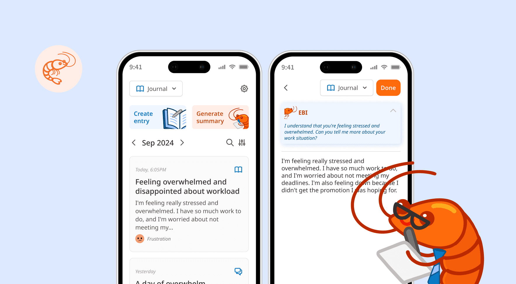
One-stop platform to submit, manage and track hospitalisation claims
Guided step-by-step process
Eligible policies and policyholder information is automatically retrieved from backend systems, reducing unnecessary form-filling
Submission requirements stated clearly upfront, preventing unnecessary resubmissions
Real time status updates
Clear visibility on claim progress with push notifications on status updates, eliminating uncertainty and providing reassurance.
Easy reconciliation upon payout
A letter containing a detailed breakdown is available for immediate download upon claim approval, allowing for prompt reconciliation
Manual submission process and lack of status updates create a fragmented experience
Based on our quarterly survey results, customer satisfaction scores for hospitalisation claims were consistently below target with verbatims surrounding tedious form filling and lack of timely status updates. I validated these findings through interviews with 6 customers, which revealed 3 core pain points:

Repeated manual submissions
Due to the length of insurance coverage (up to 1 year post-hospitalisation), it was common for most to have multiple follow-up appointments. Customers had to fill out a new form each time, repeatedly entering the same information.
Tedious manual tracking
Without a centralised platform, customers were left to track claims manually, using personal spreadsheets or relying on unofficial channels like WhatsApp with their agents. This made it difficult to reconcile payments and created a sense of uncertainty.

Delayed payout communications
The claim outcome letter was sent via post and could take up to a week to arrive, while the payment was processed separately on the same day. This information gap left customers in the dark, unable to understand what the payment was for.
How might we help customers easily submit, manage and track their hospitalisation claims?
Business considerations
Manual processes were not only frustrating for users but also caused significant pain points for staff
High email volume: Staff received 150-200 emails a day on average which had to be reviewed and sorted manually.
Tedious manual data entry: Each claim then had to be manually input into their system, a process that took 2-3 hours of effort daily.
Poor quality submissions: As there was no validation process, incomplete or incorrect submissions were common. Staff had to spend additional time reaching out to customers, further delaying the process.

Balancing user needs and operational efficiency
One of the biggest challenges I had was trying to address user needs without creating excessive burden for our operations staff. I made a series of strategic compromises, ensuring that user effort was minimised without simply shifting the burden to our internal teams.
Introducing intentional friction to address operational needs
My initial design prioritized minimal customer input, leveraging on uploaded images to extract the necessary information. However, I recognised that this would significantly increase backend processing effort. To achieve an optimal balance, we re-introduced certain critical questions while still ensuring they were easy to answer for users.
Proposed

Final

Delivering on user needs within system limitations
Users wanted to track the status of individual bills, but this was incompatible with the existing backend system, which processed bills in batches. Instead of pursuing a change in workflow or expensive backend system enhancements, I proposed making the claim settlement letter available within the app. This allowed users to readily access the detailed breakdown upon claim approval.
Proposed

Final

SUPPORTING MATERIALS
Multifaceted communication strategy to encourage user adoption
To support the new feature rollout, I considered the overall communication strategy to ensure customers have access to comprehensive information via various channels. I designed the content for the corresponding webpage and an infographic for agents to share with clients easily over WhatsApp.

Infographic containing quick tips on how to prepare their documents for submission


Webpage containing information about the claims process and photo guide with good and bad examples
FINAL DESIGN
IMPACT
Digitalised claims submission improved both user satisfaction and streamlined operations
The solution successfully met both user and business objectives. Over the first 3 months, we saw a significant positive impact on key metrics:
- Managing Director, Operations
- Customer
TAKEAWAYS
Looking beyond the user
The biggest lesson I learned was that true impact comes from understanding the entire ecosystem, not just the user-facing part. By collaborating with internal staff from operations and IT, I gained insight into backend processes and pain points. This helped me design a solution not just for the user, but also was compatible with internal workflows and empowering staff to be more productive.
I also learned to effectively navigate the delicate balance between user needs and business constraints. The decision to introduce strategic friction in the user flow demonstrated that thoughtful tradeoffs can be a powerful tool for delivering a solution that is both effective for customers and sustainable for the business.