ComfortDelGro Zig
Streamlining ride bookings for passengers, minimising frustrations and maximising efficiency
As part of the UX Design and Product Management course conducted by NTU, I redesigned ComfortDelGro’s Zig mobile app for my capstone project. Along with 3 other members, we conducted research to consolidated our findings before embarking separately on the ideation and design phase of the project.
My Contributions
User Research, UIUX Design, User Testing, Prototyping
Team
Thong Huimin, Joanne Tan, Jamila Spurdle
Timeline
4 months
Background
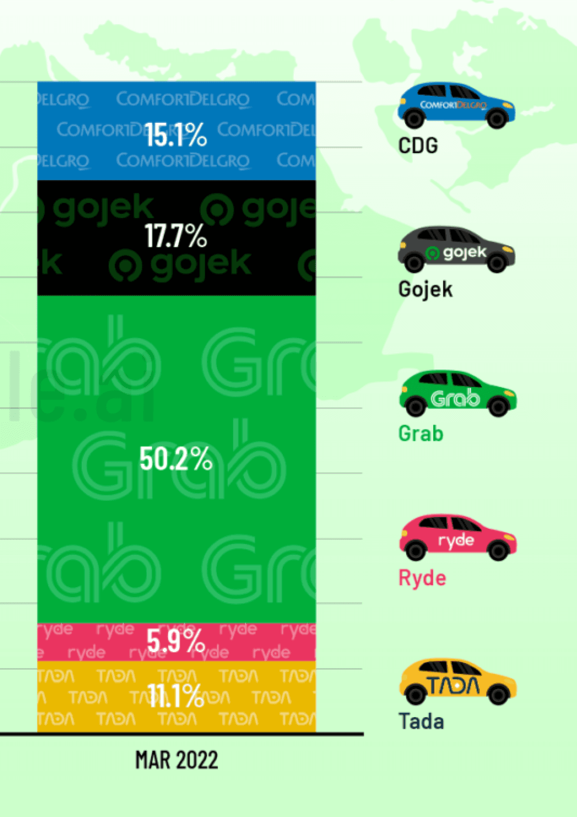
Singapore's ride-hailing market is fiercely competitive
Dominated by players like Grab and Gojek, these companies have built large user bases with strong brand loyalty. However, ComfortDelGro, a leading Singaporean taxi company, struggles to compete, capturing only 15.1% of the market share as of March 2022.
Despite a recent rebranding of their ride-hailing app, ComfortDelGro Zig, user reviews suggest ongoing frustrations, potentially leading users to switch to competitors. With the shrinking taxi population available for traditional street hails, there lies an even greater opportunity to enhance the ride-hailing experience through the app.
Problem definition
How might we streamline the ride-booking process to allow passengers to secure rides quickly without switching out to competitors?
Key features
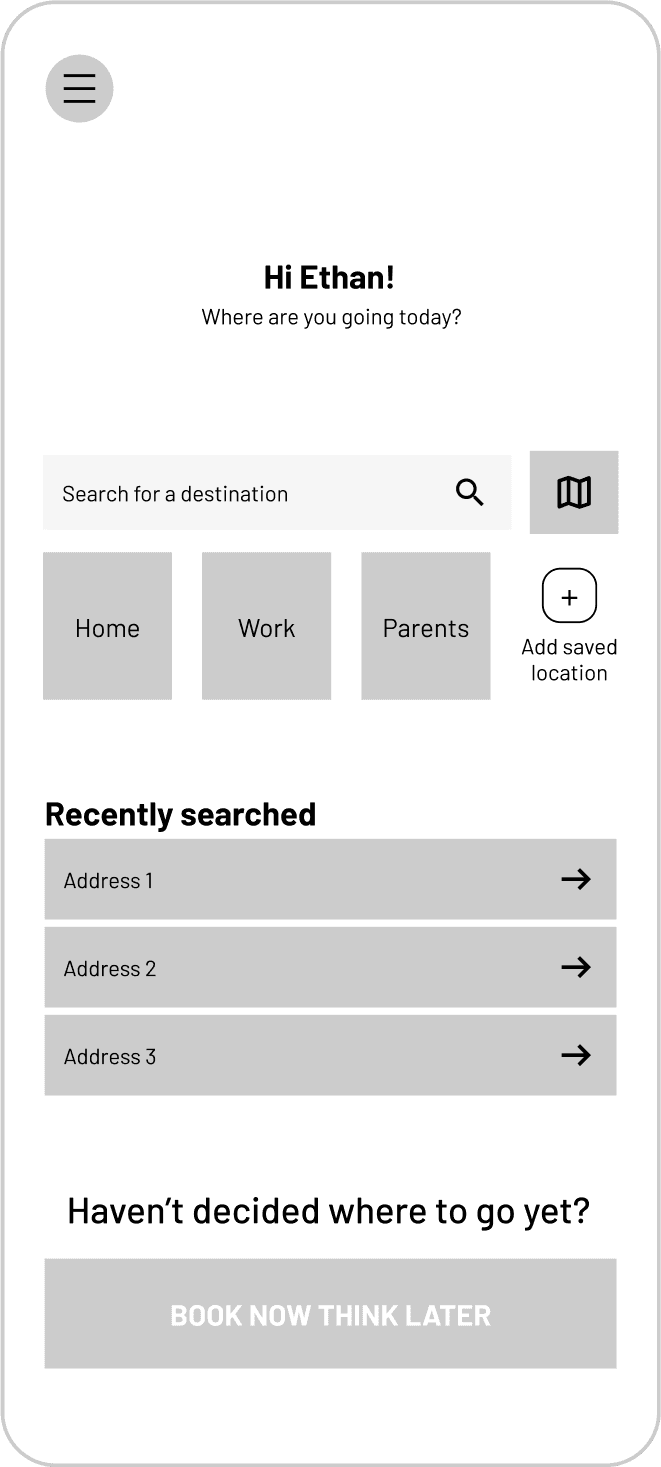
Skip the typing with quick location buttons
Eliminate the need for manual address entry with convenient quick location buttons. Get on the road faster with a user-friendly interface that anticipates your needs.

Previous searches appear here
Secure a ride first and decide on your destination later
Quickly select your destinations from previously saved locations
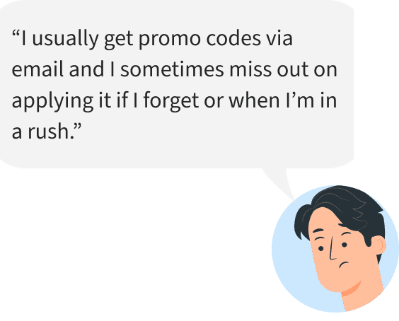
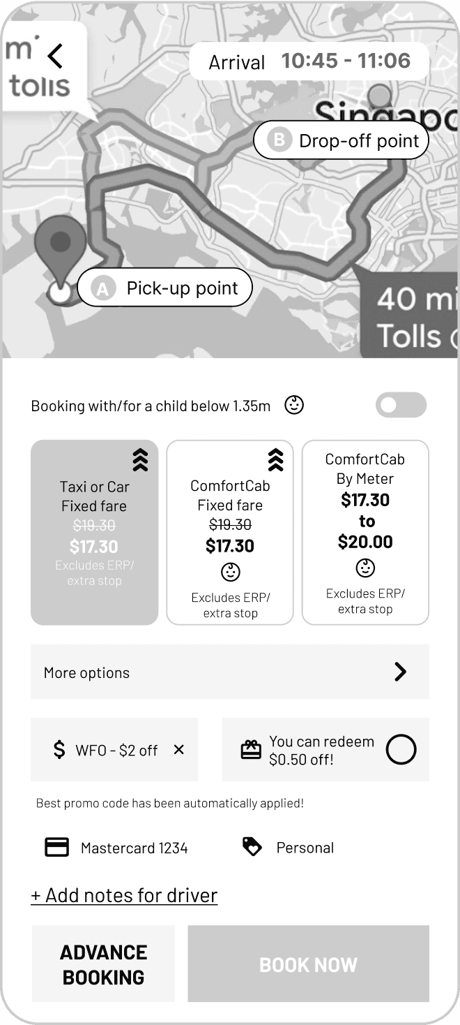
Never miss a discount again
Effortlessly access the best deals promo codes that are automatically applied. Say goodbye to missed savings and enjoy stress-free, budget-friendly rides.
Easily redeem your points with just a tap
Promo codes are automatically applied for you!
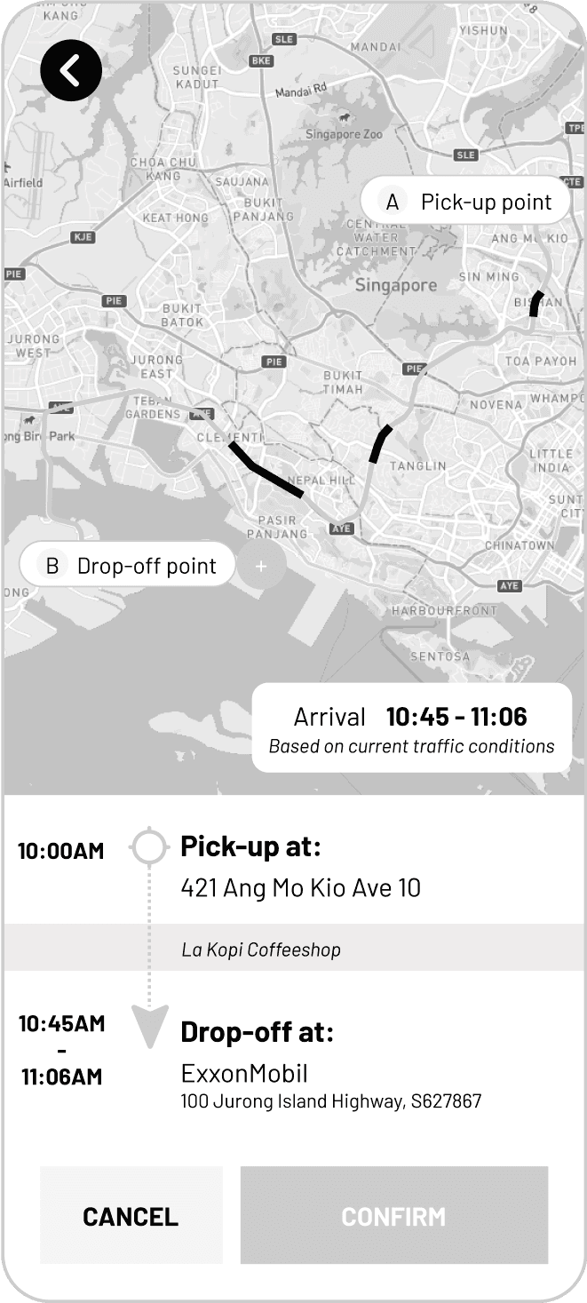
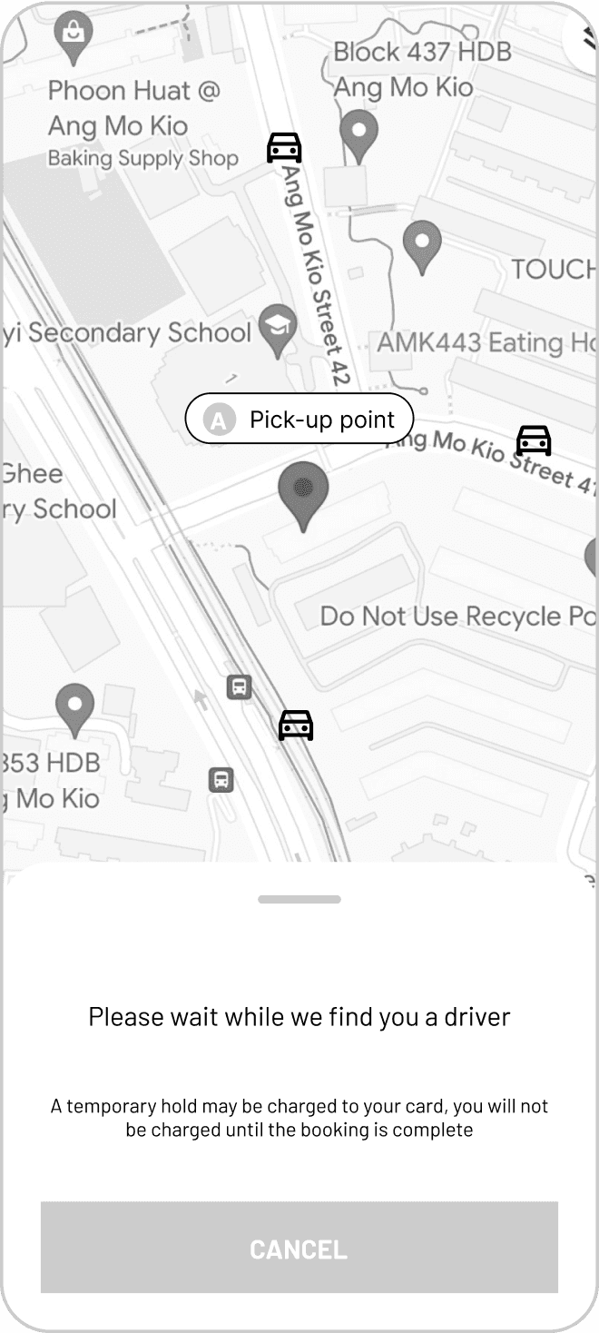
Get picked up at the right location every time
Clear location selection for both riders and drivers, avoiding missed connections and ensuring smooth pickups. Save yourself the stress (and a potentially awkward phone call).

Select from available pick-up points with description of nearby landmarks
Research
In order to better understand the issues that users were facing, we started by looking at reviews and ratings in the app store to identify the most common issues
Michael C
They really have to fix their search interface... It mixes up my origin and destination and I’ve resorted to competitor apps out of frustration.
Lucy T
There is just never any cabs available! The estimated time of arrival is also always never correct.
David N
Worst app ever! It can never pinpoint your correct location and causes alot of confusion with the driver.
Using these as our starting points, we then proceeded to conduct a survey which gathered 93 responses. Out of these respondents, we further identified 7 users to delve deeper into the issues identified and observed how they booked a ride via the current app. Three key insights emerged as a result of these research methods:
Users often use multiple apps
69.2%
do this to increases their chances of a successful booking
4/7
interviewees mentioned using multiple apps to compare fares
Everyone wants a cheaper ride
Time is of the essence
77.4%
ranked “Time taken to get a driver” as their top priority
62.9%
use ride hailing apps for when they are late

How might we...


...reduce the steps needed for users to book a ride?

... help users to see the best deals immediately?

...assure users that they will get picked up at the right location?
User Journey Map
Through user journey mapping, I visualized the entire ride-booking experience, from opening the app to reaching their destination. By analysing each step, I pinpointed moments of friction that could lead to frustration and potentially drive users to switch to competitor apps.
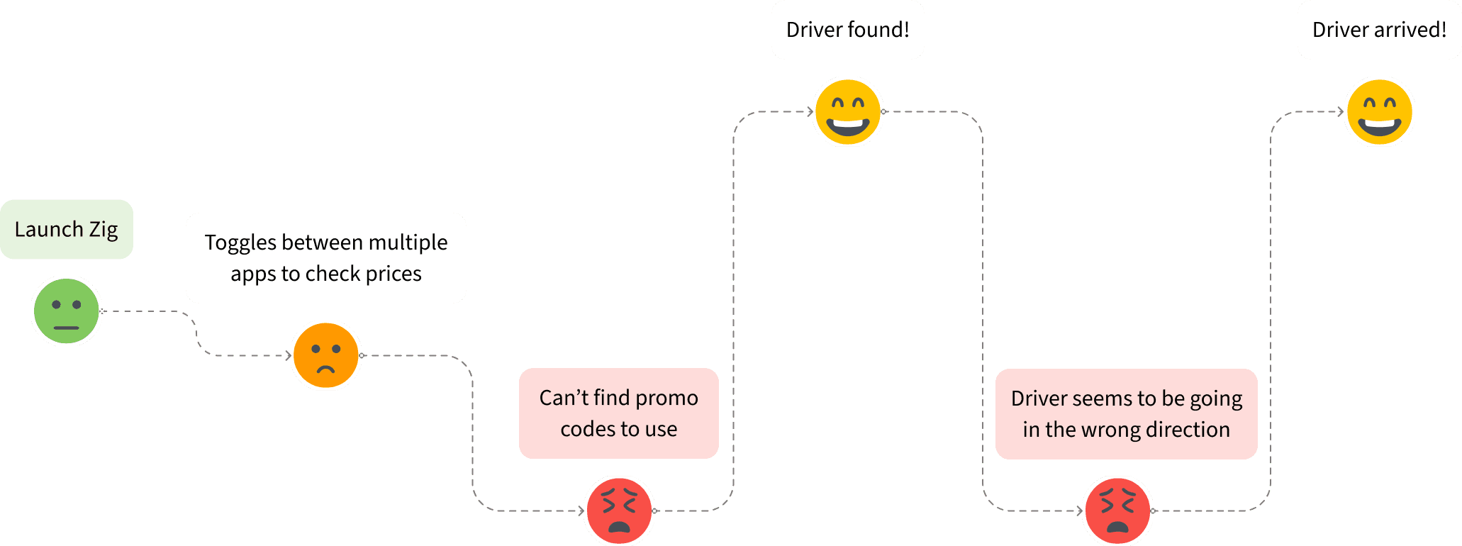
User flow
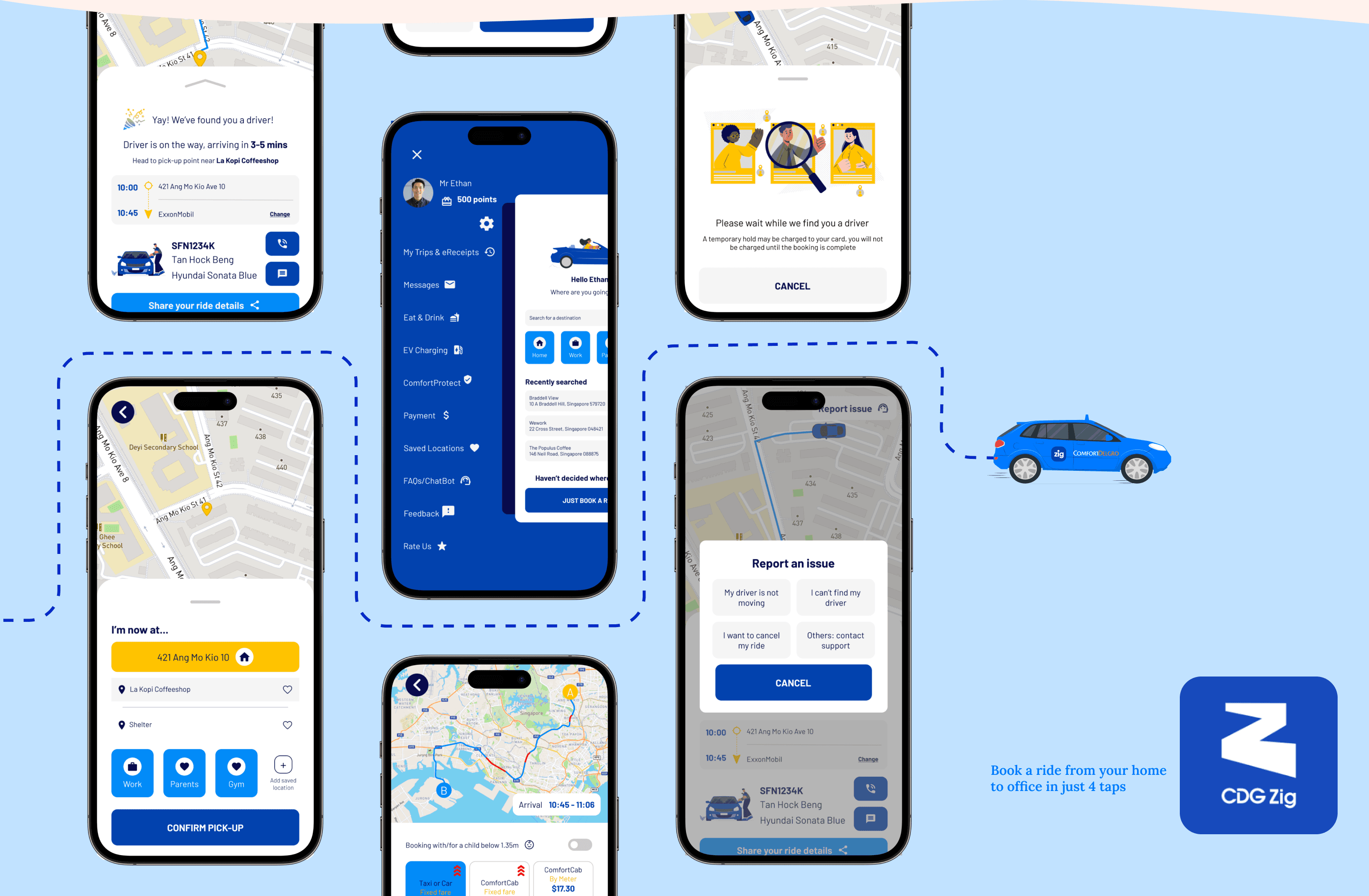
Based on the pain points identified in the user journey map, I redesigned the user flow to better streamline the booking process.
Scenario
Ethan woke up late for work today! He needs to get to his office in Jurong Island on time from his house by booking a cab
Select destination
Taps on ‘Work’ button to select destination
Confirm pick-up point
Selects ‘La Kopi Coffeeshop’ as pick-up point

Verify trip details
Confirms pick-up point & destination
Views route, traffic conditions and estimated arrival time
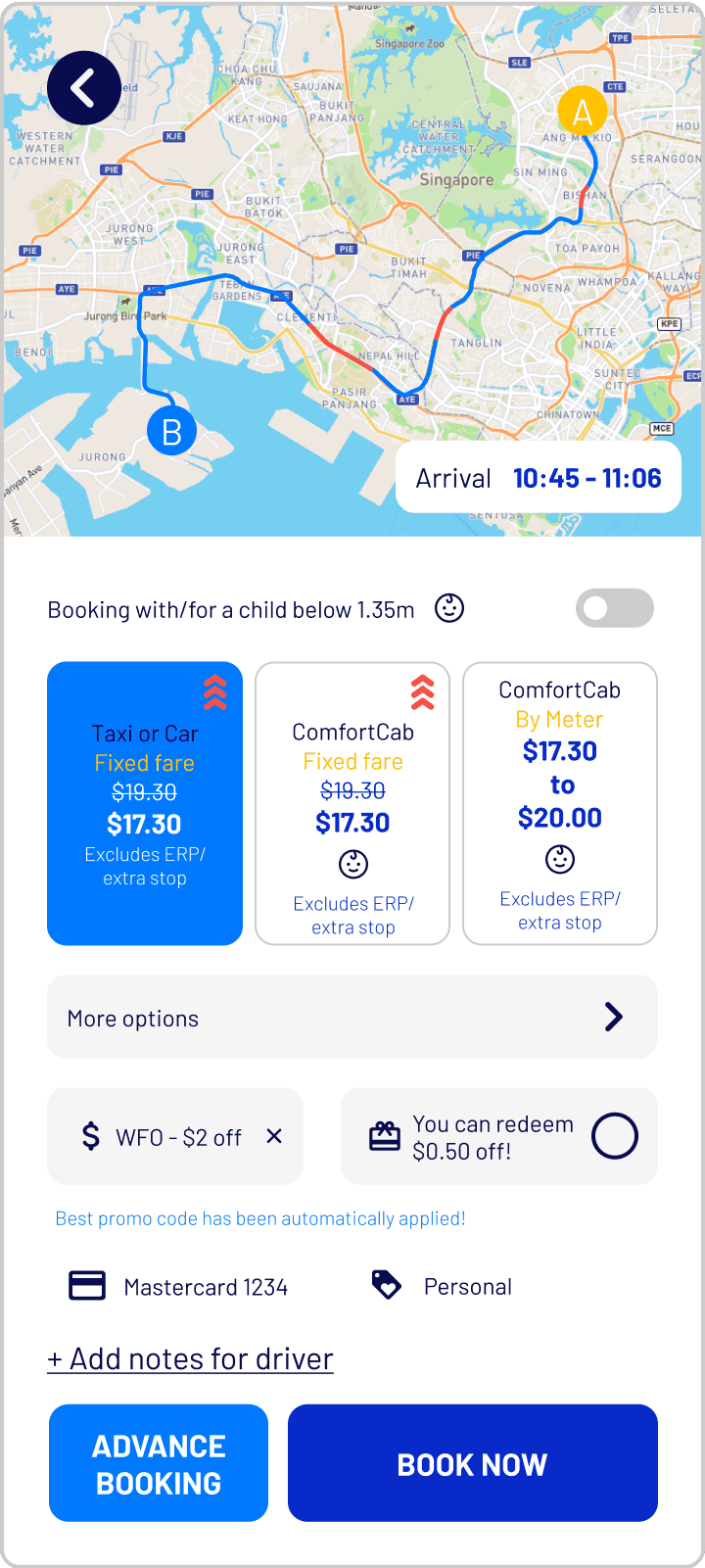
Check fares
Cheapest fare selected by default & promo code automatically applied.
Taps on ‘BOOK NOW’
Search for driver
Able to view nearby driver availability
Driver found
Clear indication of pickup point ensures no confusion with driver


Style Guide
To ensure a seamless and familiar experience for riders, I developed a style guide to establish consistency in the visual elements used throughout the app. Consistent design elements create a sense of familiarity and ease of use. I chose to keep the existing sans-serif font that was in the current app due to its clean look and high readability. I also ensured optimal color contrast for text and buttons, ensuring readability and accessibility for all users even during potentially stressful moments like booking a ride in a hurry

Usability testing
To validate my designs, I performed usability testing with users to compare the current Zig app with my redesigned prototype. Users were asked to complete the same tasks for both apps and the time taken was recorded along with any feedback given during the task.
Users liked that...

“I am able to see the map displaying my destination and pick-up point as well as any congestion along the route”
“I am able to see the map displaying my destination and pick-up point as well as any congestion along the route”

“It’s nice that the promo code is automatically applied for me so I don’t have to scramble to find it when I’m already late.”
“It’s nice that the promo code is automatically applied for me so I don’t have to scramble to find it when I’m already late.”

“Recently searched addresses are displayed on the homepage and I don’t have to search for them again”
“Recently searched addresses are displayed on the homepage and I don’t have to search for them again”

Takeaways
Overcoming operational limitations with design
While the number of available vehicles can impact wait times, design can still play a role in mitigating user frustration. By implementing features that increased the visibility of system status, users were reassured that their requests were being processed.
Importance of early usability testing
Due to time constraints, usability testing was only done after the prototyping stage. Ideally more time should be dedicated in earlier stages to gain more insights from users to better shape the design solutions as part of an iterative process.
ComfortDelGro Zig
Streamlining ride bookings for passengers, minimising frustrations and maximising efficiency
As part of the UX Design and Product Management course conducted by NTU, I redesigned ComfortDelGro’s Zig mobile app for my capstone project. Along with 3 other members, we conducted research to consolidated our findings before embarking separately on the ideation and design phase of the project.
My Contributions
User Research, UIUX Design, User Testing, Prototyping
Team
Thong Huimin, Joanne Tan, Jamila Spurdle
Timeline
4 months
Background
Singapore's ride-hailing market is fiercely competitive
Dominated by players like Grab and Gojek, these companies have built large user bases with strong brand loyalty. However, ComfortDelGro, a leading Singaporean taxi company, struggles to compete, capturing only 15.1% of the market share as of March 2022.
Despite a recent rebranding of their ride-hailing app, ComfortDelGro Zig, user reviews suggest ongoing frustrations, potentially leading users to switch to competitors. With the shrinking taxi population available for traditional street hails, there lies an even greater opportunity to enhance the ride-hailing experience through the app.
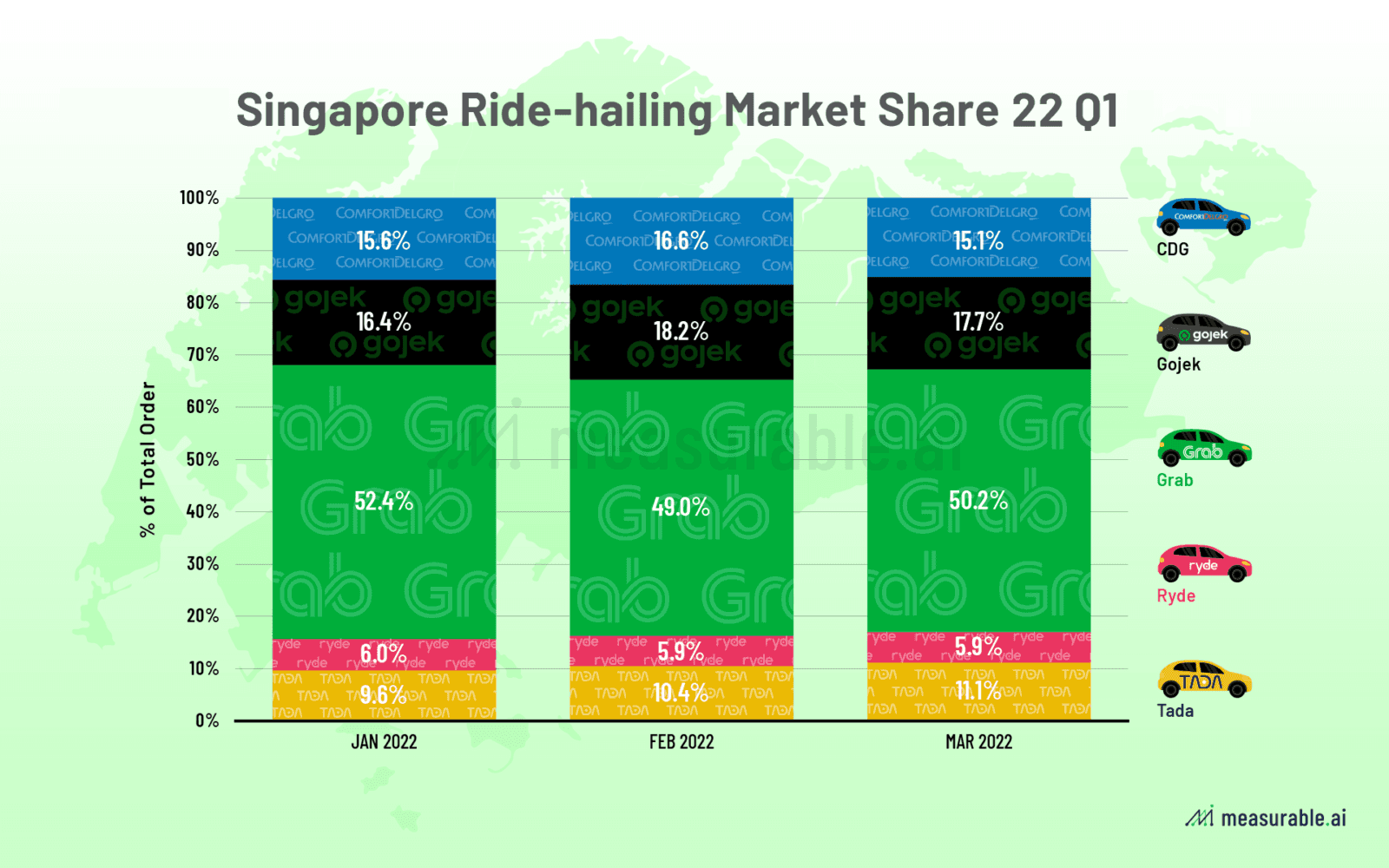
Source: Measurable AI
Problem definition
How might we streamline the ride-booking process to allow passengers to secure rides quickly without switching out to competitors?
Key features
Skip the typing with quick location buttons
Eliminate the need for manual address entry with convenient quick location buttons. Get on the road faster with a user-friendly interface that anticipates your needs.
Previous searches appear here
Secure a ride first and decide on your destination later
Quickly select your destinations from previously saved locations
Never miss a discount again
Effortlessly access the best deals promo codes that are automatically applied. Say goodbye to missed savings and enjoy stress-free, budget-friendly rides.
Easily redeem your points with just a tap
Promo codes are automatically applied for you!
Get picked up at the right location every time
Clear location selection for both riders and drivers, avoiding missed connections and ensuring smooth pickups. Save yourself the stress (and a potentially awkward phone call).
Select from available pick-up points with description of nearby landmarks
Research
In order to better understand the issues that users were facing, we started by looking at reviews and ratings in the app store to identify the most common issues
Michael C
They really have to fix their search interface... It mixes up my origin and destination and I’ve resorted to competitor apps out of frustration.
Lucy T
There is just never any cabs available! The estimated time of arrival is also always never correct.
David N
Worst app ever! It can never pinpoint your correct location and causes alot of confusion with the driver.
Using these as our starting points, we then proceeded to conduct a survey which gathered 93 responses. Out of these respondents, we further identified 7 users to delve deeper into the issues identified and observed how they booked a ride via the current app. Three key insights emerged as a result of these research methods:
Users often use multiple apps
69.2%
do this to increases their chances of a successful booking
4/7
interviewees mentioned using multiple apps to compare fares
Everyone wants a cheaper ride

Time is of the essence
77.4%
ranked “Time taken to get a driver” as their top priority
62.9%
use ride hailing apps for when they are late

How might we...

...reduce the steps needed for users to book a ride?

... help users to see the best deals immediately?

...assure users that they will get picked up at the right location?

User Journey Map
Through user journey mapping, I visualized the entire ride-booking experience, from opening the app to reaching their destination. By analysing each step, I pinpointed moments of friction that could lead to frustration and potentially drive users to switch to competitor apps.
User flow
Based on the pain points identified in the user journey map, I redesigned the user flow to better streamline the booking process.
Scenario
Ethan woke up late for work today! He needs to get to his office in Jurong Island on time from his house by booking a cab
Select destination
Select destination
Taps on ‘Work’ button to select destination
Confirm pick-up
Selects ‘La Kopi Coffeeshop’ as pick-up point
Verify trip details
Confirms pick-up point & destination
Views route, traffic conditions and estimated arrival time
Check fares
Cheapest fare selected by default & promo code automatically applied.
Taps on ‘BOOK NOW’
Search for driver
Able to view nearby driver availability
Driver found
Clear indication of pickup point ensures no confusion with driver
Style Guide
To ensure a seamless and familiar experience for riders, I developed a style guide to establish consistency in the visual elements used throughout the app. Consistent design elements create a sense of familiarity and ease of use. I chose to keep the existing sans-serif font that was in the current app due to its clean look and high readability. I also ensured optimal color contrast for text and buttons, ensuring readability and accessibility for all users even during potentially stressful moments like booking a ride in a hurry
Usability testing
To validate my designs, I performed usability testing with users to compare the current Zig app with my redesigned prototype. Users were asked to complete the same tasks for both apps and the time taken was recorded along with any feedback given during the task.
Users liked that...

“I am able to see the map displaying my destination and pick-up point as well as any congestion along the route”

“It’s nice that the promo code is automatically applied for me so I don’t have to scramble to find it when I’m already late.”

“Recently searched addresses are displayed on the homepage and I don’t have to search for them again”
Takeaways
Overcoming operational limitations with design
While the number of available vehicles can impact wait times, design can still play a role in mitigating user frustration. By implementing features that increased the visibility of system status, users were reassured that their requests were being processed.
Importance of early usability testing
Due to time constraints, usability testing was only done after the prototyping stage. Ideally more time should be dedicated in earlier stages to gain more insights from users to better shape the design solutions as part of an iterative process.
See more of my work:

Connecting passionate volunteers with Singapore's tech-for-good initiatives through a redesigned Better.sg website.
Better.sg

ComfortDelGro
Streamlining ride bookings for passengers, minimising frustrations and maximising efficiency
EBI
Empowering therapy seekers to better explore and express their thoughts through guided and interactive journaling.
Let’s connect!
Feel free to reach out for collaborations or just a friendly hello. 😀